













Live state
 Live

 4
 5



While the summary card sufficed for tenured riders' login hour tracking, the detailed page significantly impacted new riders, achieving 25% adoption.






Offers are a key incentive mechanism for partners to earn beyond their base pay. However, we noticed a sharp increase in support tickets & rising on-ground noise. These directly impacted delivery partner trust, while also leading to suboptimal spend (ICPO) for the business.
Imagine explaining quantum physics with emojis. That's how we felt, turning a super complex business structure into a simple, effective UI.
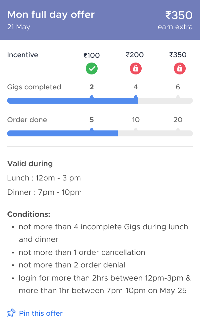
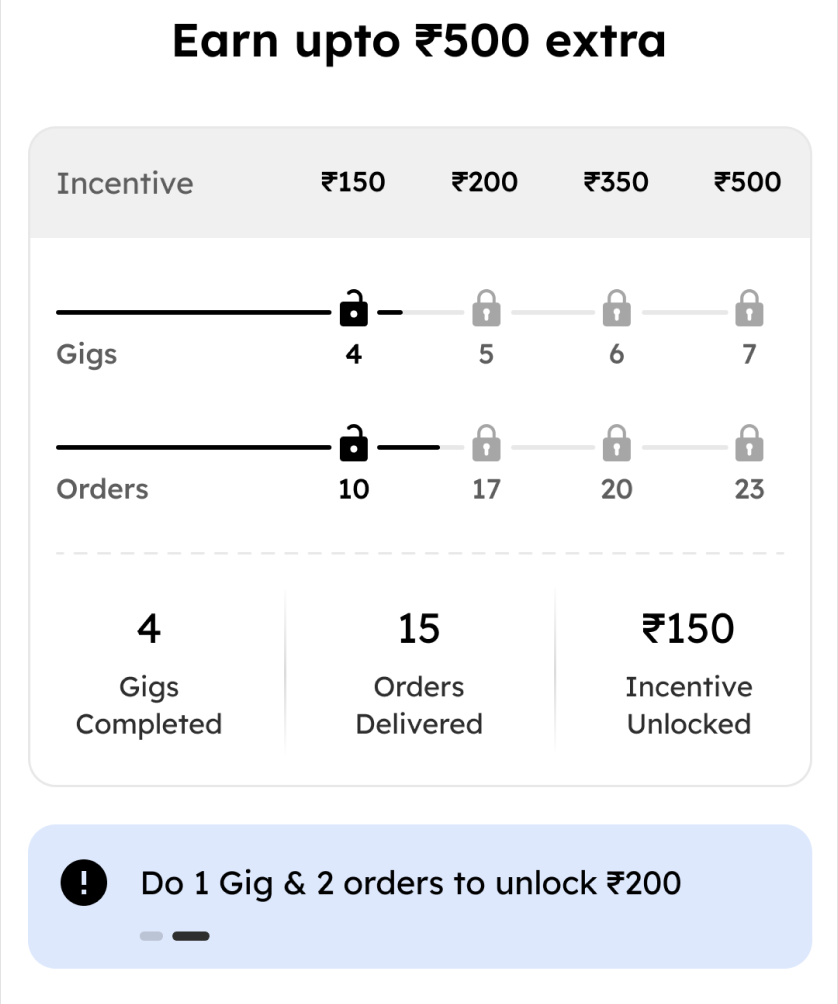
Riders have to complete both their gig and order targets simultaneously to earn a specific incentive amount.
Riders have to be available during the meal times the offer is valid for.
Riders also have to complete mandatory login hours during those meal times.
On top of that, all the underlying conditions need to be met to achieve the offer.

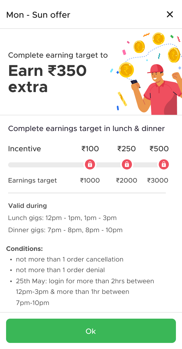
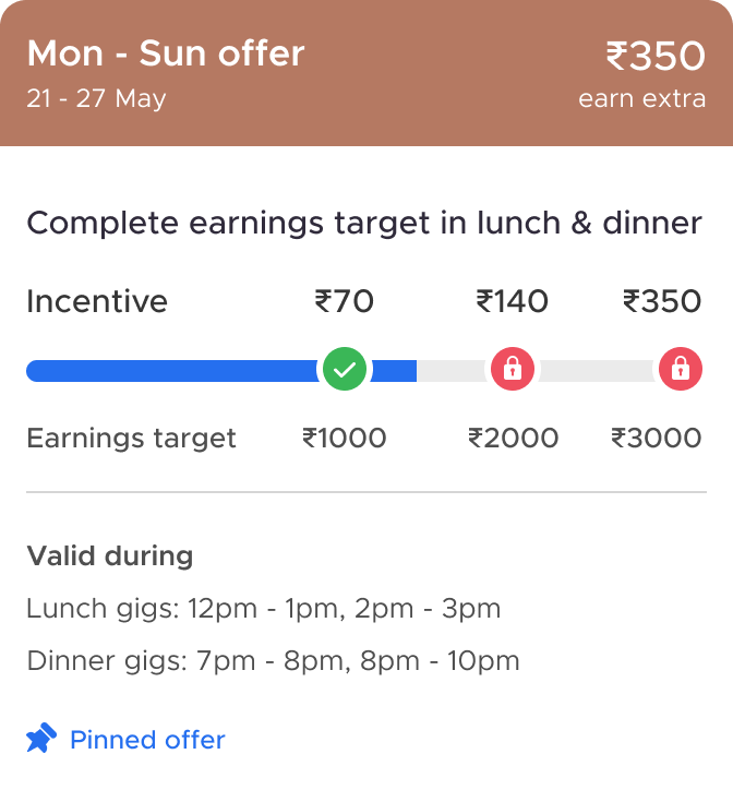
The incentive structure is incremental, not additive - unlocking a higher milestone removes the lower one, which confuses partners due to the tick mark appearing once a milestone is reached.


The valid meal times and the mandatory login hours within them were disconnected. Riders also often missed those hours due to a lack of real-time tracking and visual cues.
Offers also had conditions like limiting cancellations and denials, but these were shown only as plain text rather than through visual indicators.


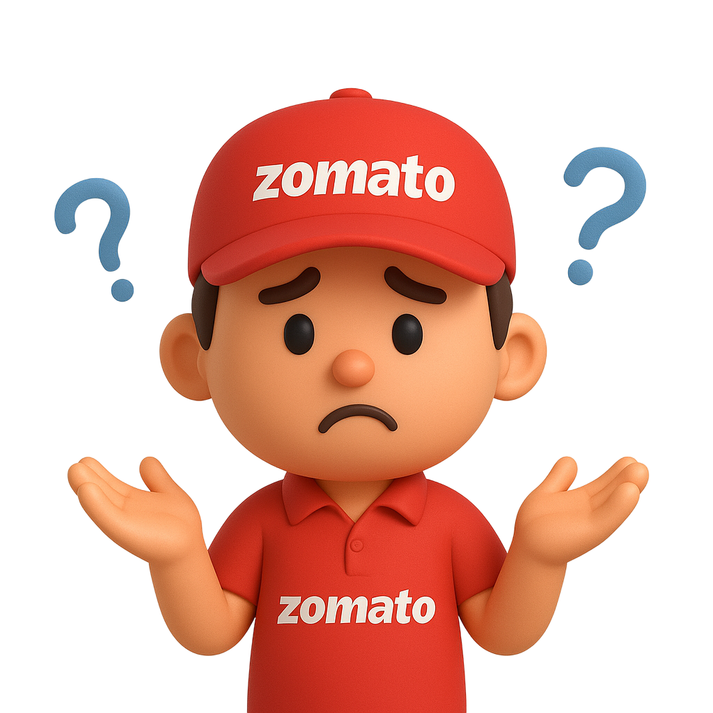
Sir, ye “conditions” ka kya matlab hota h?

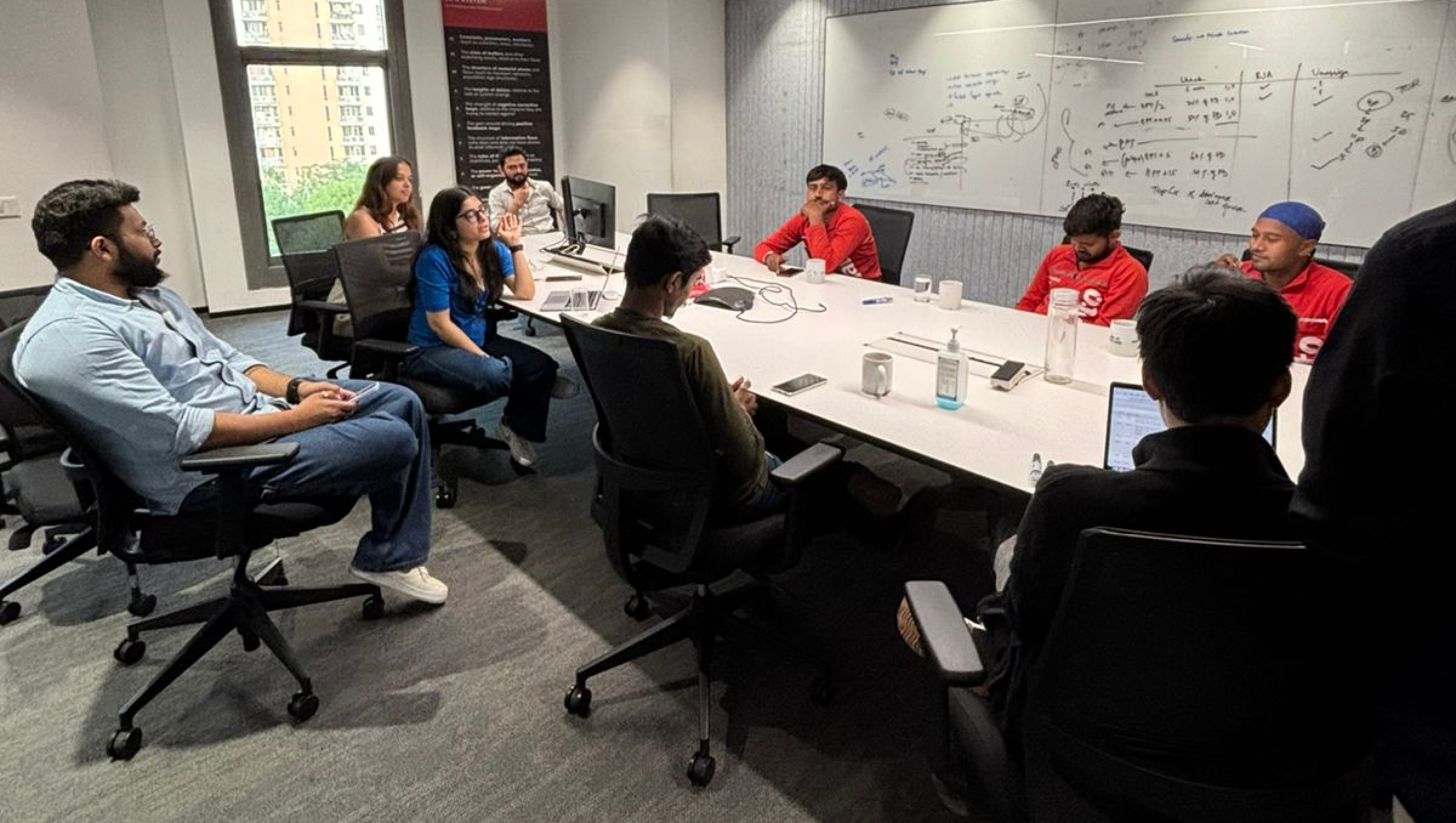
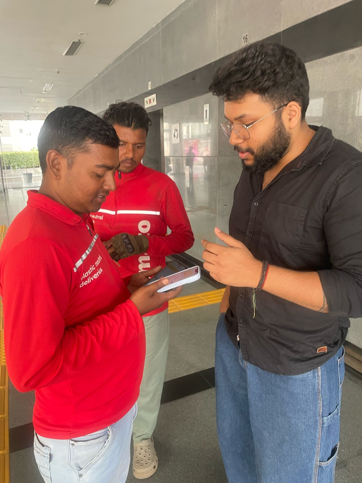
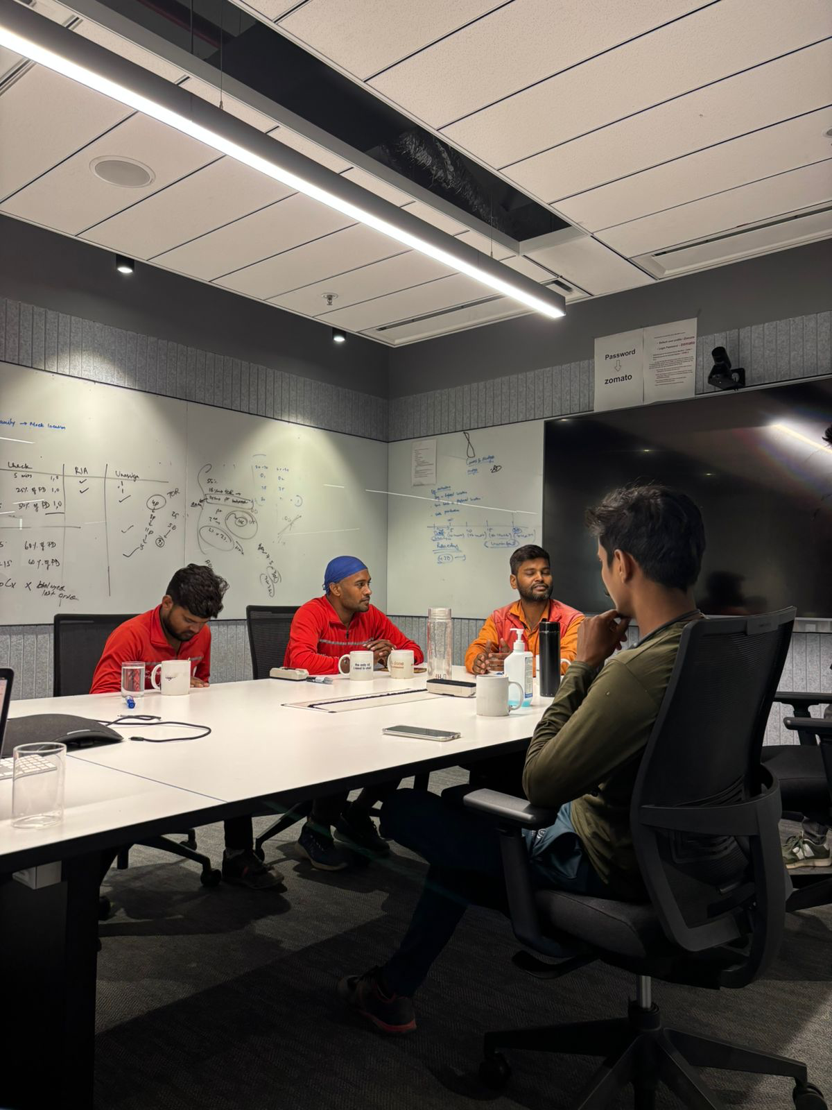
We engaged in focused group discussions and guerrilla testing to deeply understand delivery partners' daily realities and how they perceive the current offers structure. Our research targeted two rider cohorts based on Lifetime Orders (LTO), with a balanced distribution of full-time and part-time riders within each:
Sir, kaunsa offer chalra h aaj?
Bhaiya, kitna login bacha h aaj ka?



Riders typically skimmed offer conditions, focusing on numbers and keywords rather than full sentences
Riders set alarms and timers to meet mandatory peak-hour login requirements

New riders often took on-ground help from tenured riders to understand early offer constructs
We iterated extensively, solving problems one by one. We explored & tested numerous design versions to simplify gig milestones & make compulsory login hours more trackable.
We initially aimed to streamline the display of multiple progress bars. However, testing revealed that tenured riders had already adapted to the existing design, making drastic changes a potential source of a steep learning curve.
We focused on simplifying login hour tracking by introducing meal times and icons. While effective, we refined this to use specific time ranges (e.g., "12 PM - 3 PM") instead of meal names (like "Lunch"), as riders primarily remember the numerical time slots, which also varied by city.
& obviously infinite more iterations😫

Where it all comes together
 Locked
 Unlocked
 Achieved
While the summary card sufficed for tenured riders' login hour tracking, the detailed page significantly impacted new riders, achieving 25% adoption.
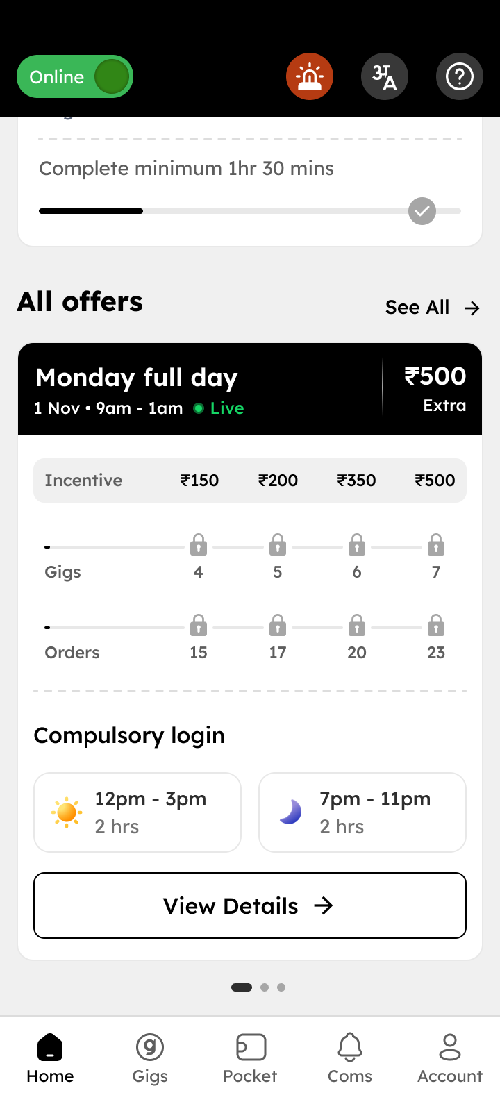
Milestones became extremely clear: tick marks now appear only when an offer is fully completed & the amount has been successfully transferred to the pocket
When an offer is breached, the page greys out, highlighting only the specific compliance failure in red for immediate clarity.
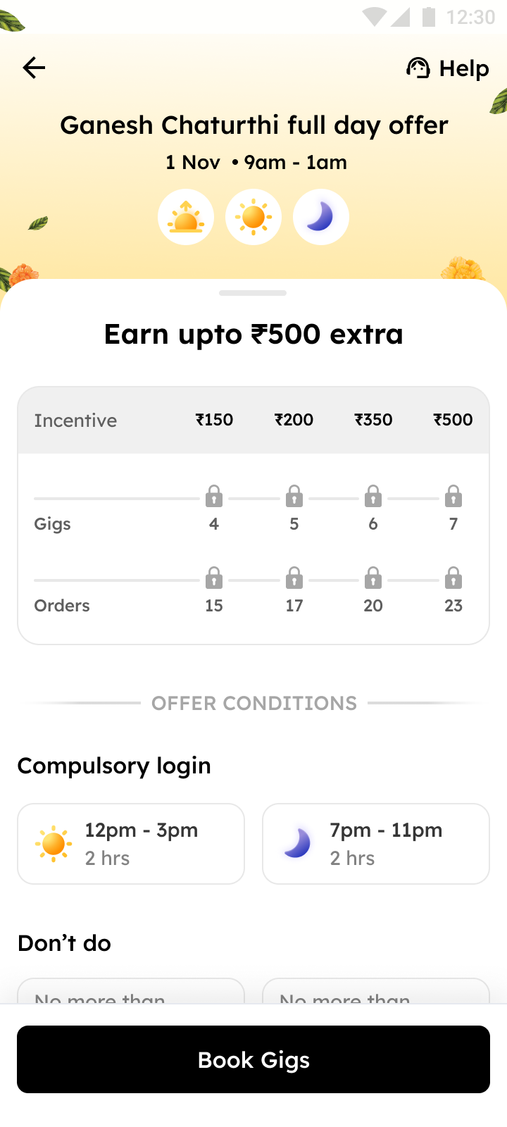
A brand-new page, designed specially for new riders with fewer than 50 lifetime orders (LTO < 50). Instead of decoding offers by trial and error or asking tenured riders for help, they now get the full picture in one place.
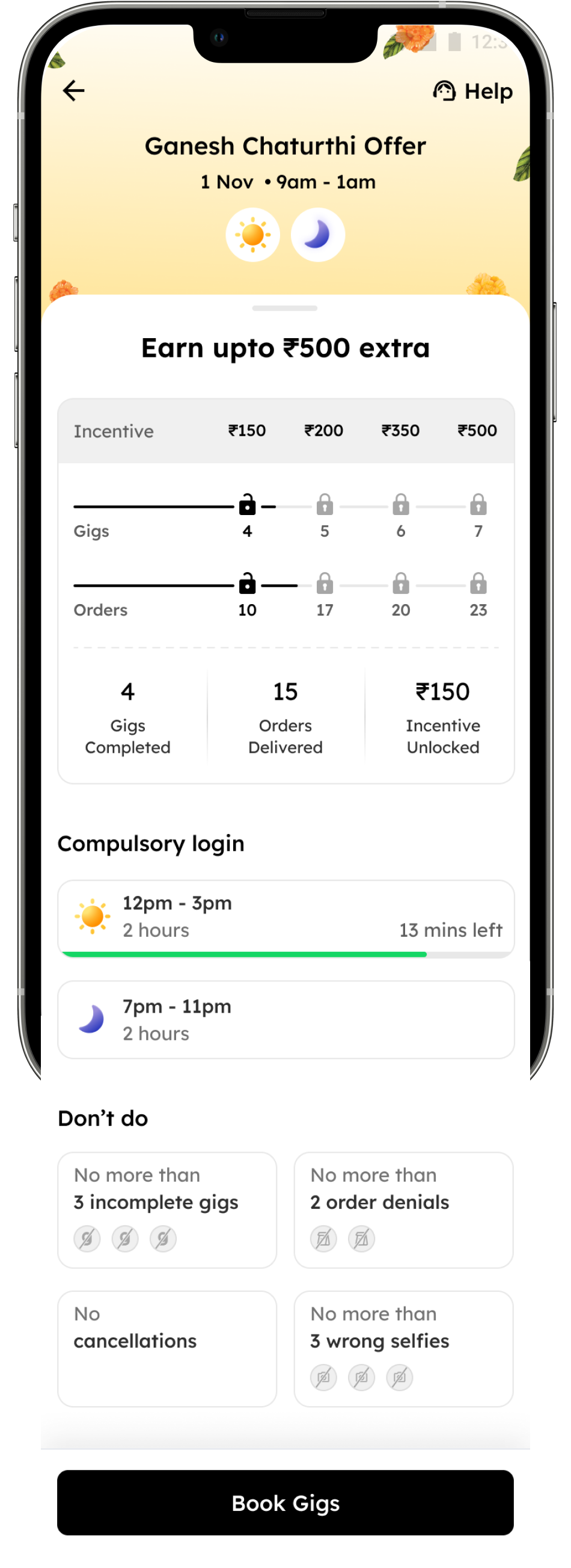
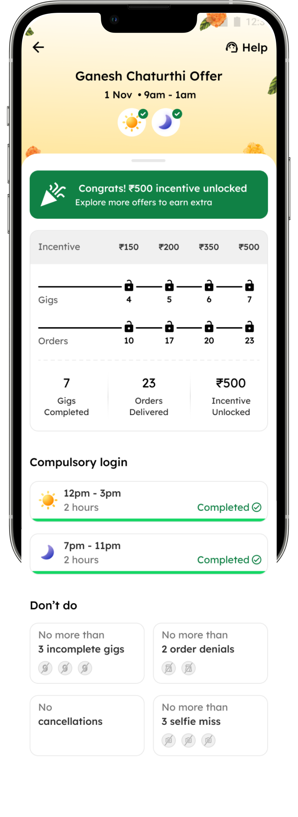
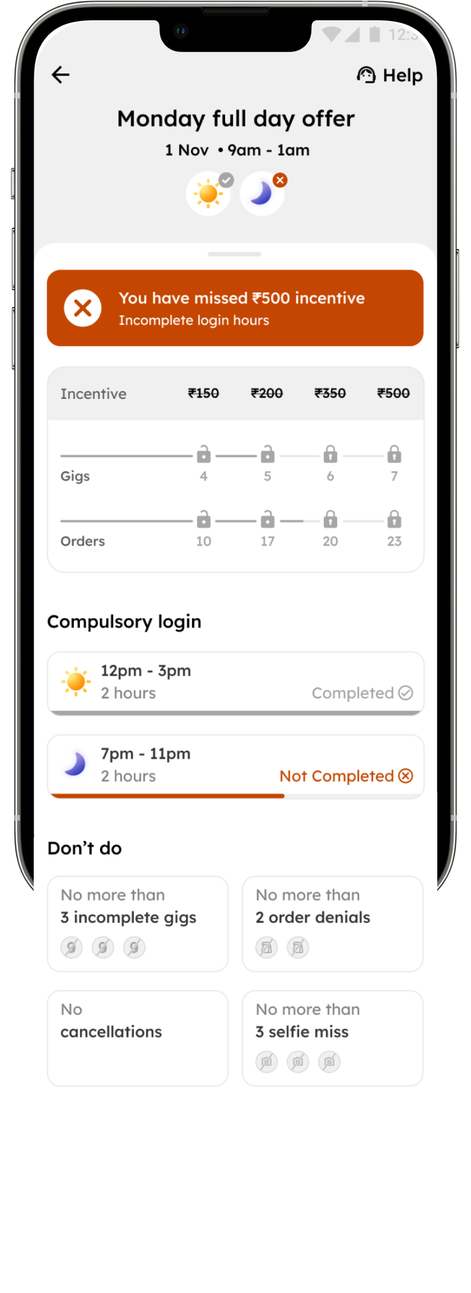

We introduced a summarized view of offer cards on the homepage, with clear milestone states—locked, unlocked, and ticked—so delivery partners instantly know what’s achieved and what’s pending.
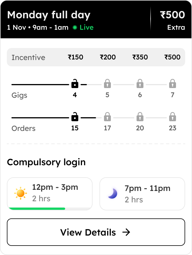

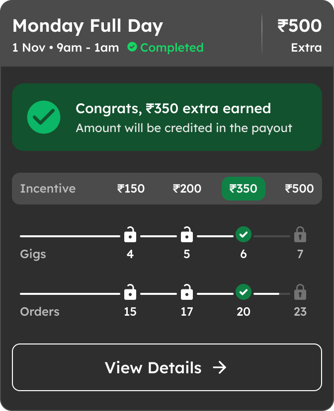
We made compulsory login times easier to follow with real-time progress bars, clear minute counts, and relatable meal-time icons.
We added real-time counters for gigs, orders, and earned incentives, along with timely nudges to guide delivery partners on their next steps.




We used red icons under a “Don’t do’s” label to show breaches clearly. As riders crossed limits, icons turned red, and the offer expired once the threshold was hit.
All offer types followed the same design language, making them easier to understand and use without confusion.
After incorporating feedback from user testing we went live in April’25
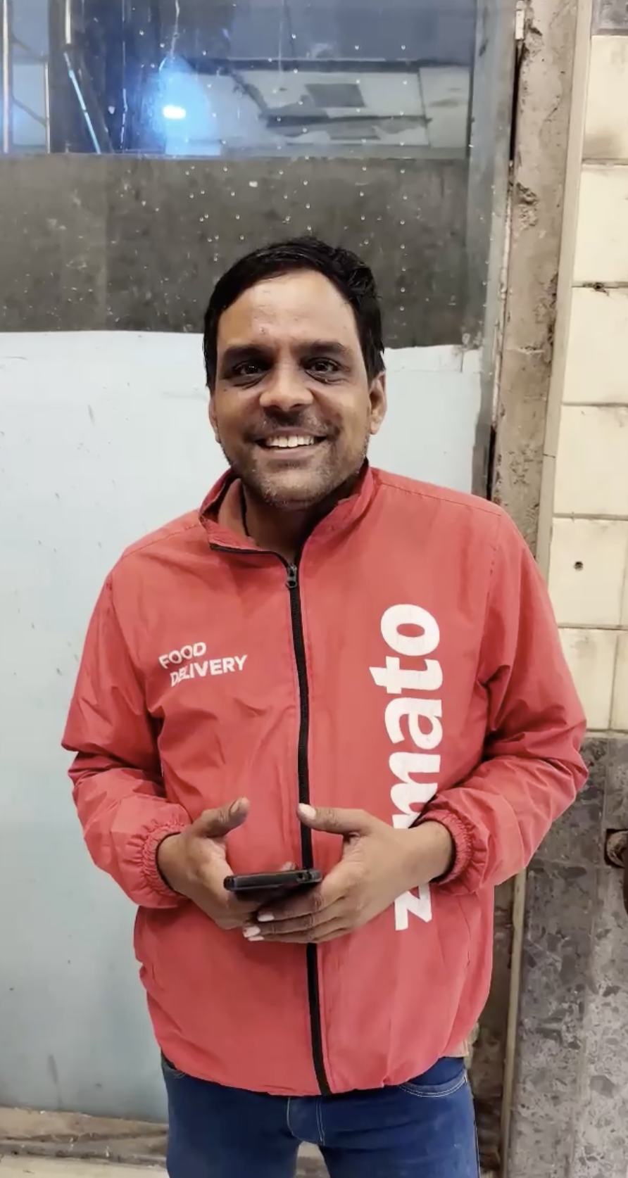


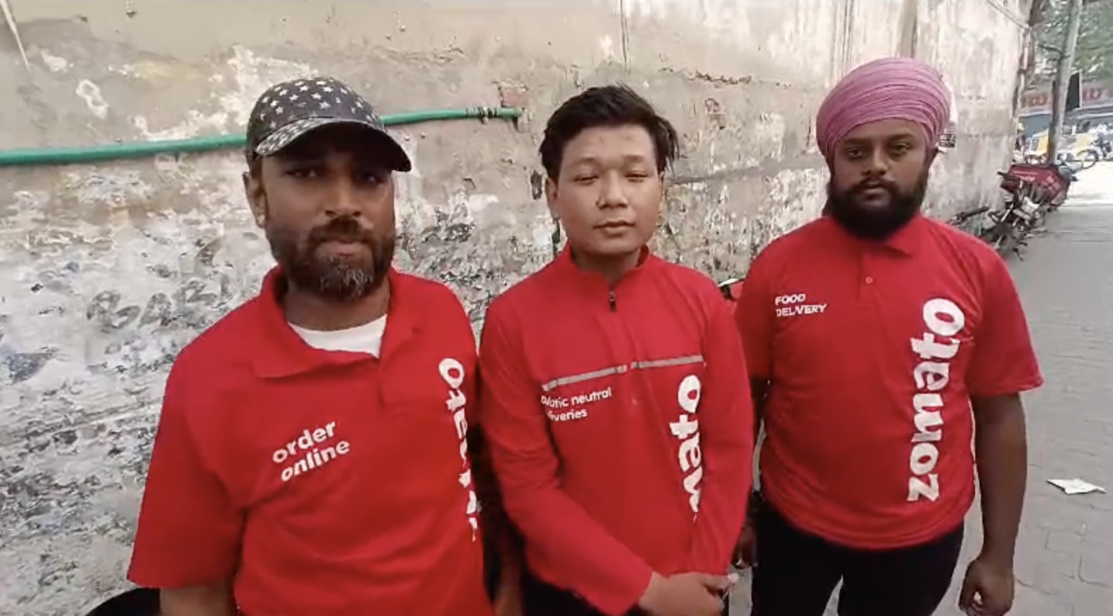
Ab sari conditions araam se pata lagti hai jaise selfie miss, cancellations or sabhi

Timings bade araam se dekh sakte hai


15%
Reduction in support tickets due to offer payouts


60%
Offers achievement rate improved compared to the older 49%

100+
Riders shared qualitative feedback through videos
By making offer milestones and earning opportunities clearer, delivery partners were more motivated to complete additional orders and unlock rewards. This behavioral shift also contributed to faster deliveries, slightly improving the overall consumer experience.

 Completed

 6

 Missed


 4